|
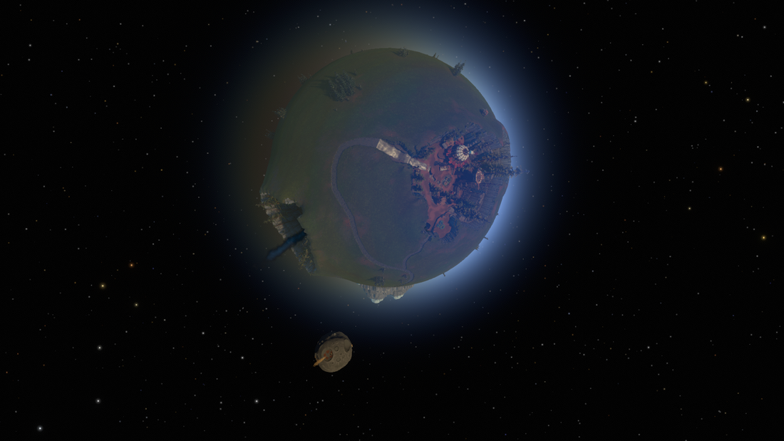
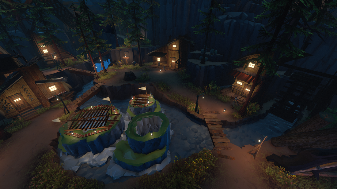
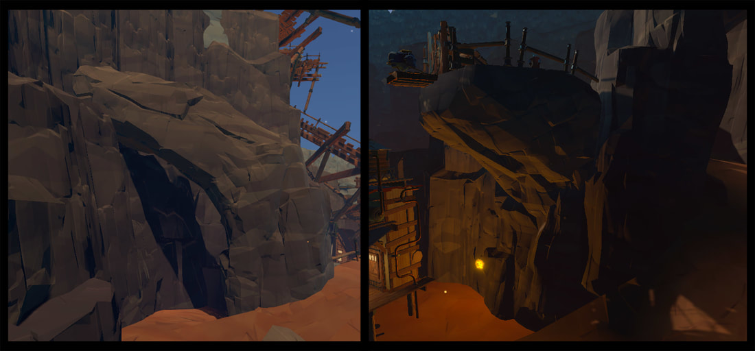
Hello everyone! We’re back with more updates on our art. This time we’re delving into the Hearthian homeworld: Timber Hearth. Timber Hearth has always been the proving grounds for our art style because it contains a wide variety of natural environments, as well as the Hearthian civilization. Between the different craters on its surface, it has a wide variety of challenges to solve: specific pathways, cliffs, jumps, ramps, overhangs, and lots of important sightlines. The Hearthian home planet, Timber Hearth and its Attlerock Moon When we initially started work on the game at Mobius, we had a very small art team and a very limited time frame to make the game. Because we were working with so few resources, our main objective was making the environment consistent and designing it in such a way as to point players to important objectives. By the time we had decided to reboot our art style, we already had a number of ideas for how to improve our pipeline. The post alpha Timber Hearth Village vs. a paint over of the same scene that shows our goal to improve the lighting, fog, and thematic design of the environment. The same part of the village at night time in the final pass. First, we needed better tools, lighting, fog, and material shaders. Our technical artist created a number of useful tools for placing objects and aligning them to spherical environments. We switched over to Unity 5’s physically based rendering pipeline so that we could take advantage of the greater diversity in material types and lighting options, with the addition of our own custom variants of the new shaders. We also created 3D fog lookups so that we could have our fog density and color vary based on the radius of a sphere as well as the position of the sun, giving the atmosphere of each planet a natural progression based on time of day. Some early shots of day vs. night lighting on the new rocks. Second, we needed a more modular art style that worked with the main visual strength of Outer Wilds - the fact that our lighting is dynamically caused by the sun. Initially our modular assets created problems for level design because the rounded shapes created too much visual noise and distracted from the points of interest. We tried a number of different shapes and styles, but the winner was a hard-edged style that, when combined with our new alignment tools, allowed us to carefully build clear paths and cliffs as needed by design. A high poly style test vs. the first version of our final style, and final in game art of one of the Timber Hearth craters. Not only did the hard-edge rocks help with level design, but they reminded us of national park posters, which encouraged our final aesthetic style. We leaned into the hard edges with a simplified low-poly aesthetic for rocks that feels naturalistic but falls into the background, so as not to create false paths. By using geometry for small scale detail and textures for large-scale gradients, we were able to create an environment that reacts well to dynamic lighting while still feeling massive from a distance. Left, old rock test in greybox crater, right final art.
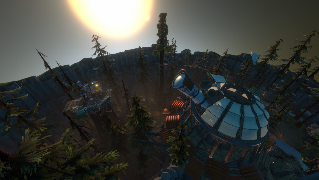
Finally, and most importantly, we needed our new style to work with level design. One of the main objectives in Outer Wilds is navigating complex 3D spaces, which can be very challenging. Our new hard-edged rocks were the top contender on this front for a variety of reasons. The clear edges create a clear delineation between walkable floors and walls, which helps players to jetpack around the surface. They respond well to lighting, which we can use to highlight pathways and interactable objects. Finally, because the rocks are simplified and low-poly, we can emphasize architecture and technology with higher detail models to create points of interest. Comments are closed.
|
Archives
June 2024
From the
Updates on our games, our process, and the joys of being Mobius Digital. Categories |


 RSS Feed