|
When developing UI we have to take game design, aesthetic, and technical limits into consideration. On the tech side, for instance, we've been updating the backend of the UI system, which was originally created in Unity 3. Good times. In terms of in-game UI, we have both ship and helmet UI, which need to feel very differently while coming from the same aesthetic. Currently we're starting to take the player helmet concepts and test them in-engine, but for a discussion on the process we'll hand the reins over to Alice! Hello, this is Alice, your resident 2D artist at Mobius Digital! For Outer Wilds, the overall UI look and feel is retro NASA, but also minimalistic and modern. Alex also requested (demanded, really) that we shy away from anything decidedly “futuristic-looking.” With that in mind, I set out to find some reference to suit our desired aesthetic. 1) Shape/line language First, I researched some NASA control panels and took note of the shapes and line treatments that made them look the way they did. I mainly used these images as references. 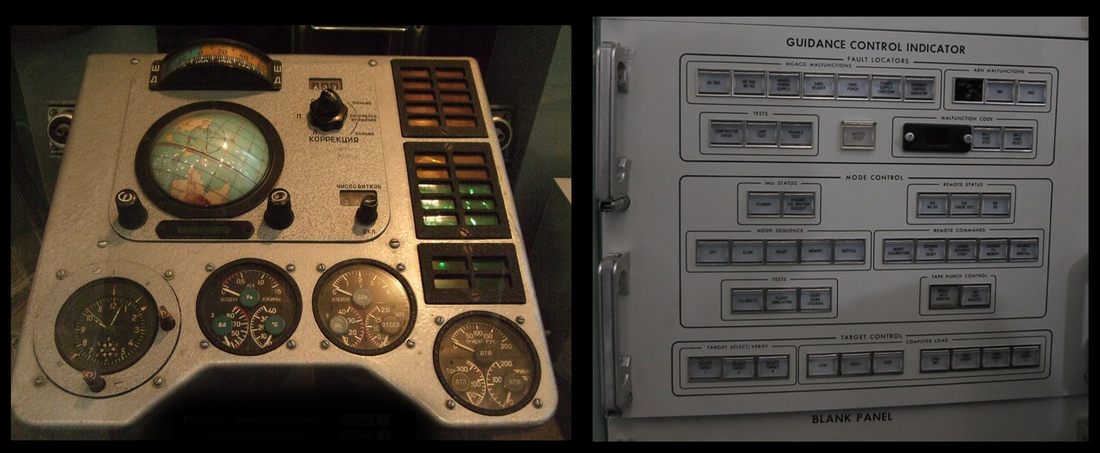 While there is some mix of sharp-cornered and round-cornered rectangular shapes in our reference, we decided to stick with the rounded corners since we knew there would be circular elements mixed in the UI as well. The line weight in general was thin, and used to denote different functions and categories of buttons and switches. 2) Projected display Our reference consisted largely of physical control panels, but we knew that the HUD would ultimately be projected on the player character’s visor and thus would resemble white on black screen displays. We based a lot of highlight colors used on these reference images. (Yes, the second one is from Star Wars.) 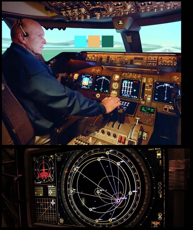 3) Gadgets, functional-looking details, and random data output At this point, it was clear that a major theme in our UI design was a mix of inspiration from physical gadgets as well as digital elements. I based the resources portion of the HUD on the round shapes of these fuel and gas tank gauges, and I also threw in some tech-y looking read-outs within for flavor. 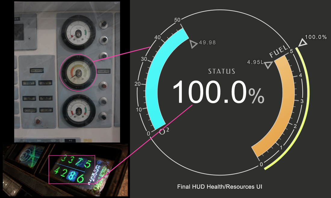 At this time, you may ask: what exactly is the process to use various reference images to come up with the right UI aesthetic? What parts do you use, and which parts do you leave out? Well, the short answer is lots of iterations! Here are all the previous versions of the Health and Resources portion of the HUD: 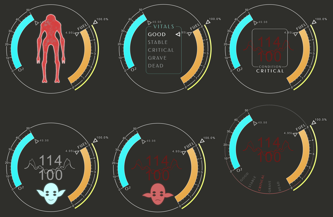 Here, I tried several different ways to represent the player character as a body. Alex had expressed that he liked the initial UI element of the player’s full body due to it bringing humanity to the player. However, it became clearer to me later that trying to accomplish too much with one UI element can become cluttered, and began to clash with some of the other UI. 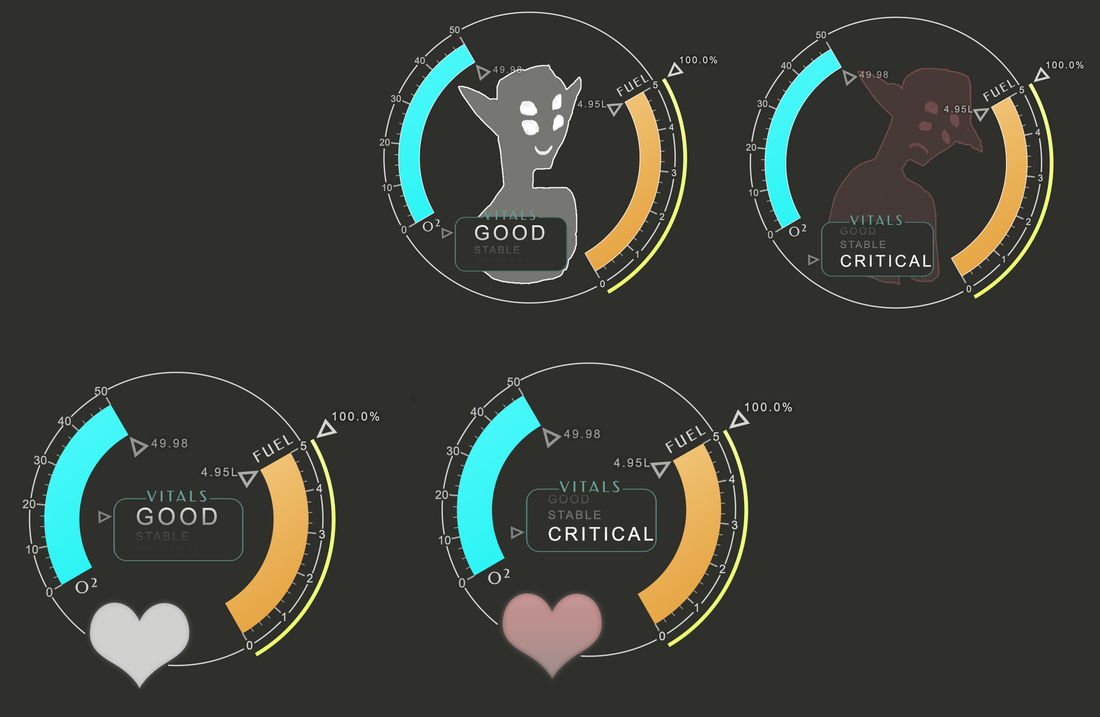 In the end, we went with the most straightforward concept for health by representing it with a simple percentage. 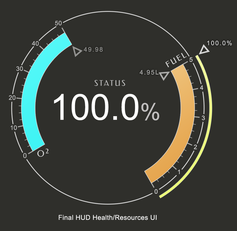 Is it a percentage of overall health? Or your rate of survival? Considering the somewhat dry but playful disposition of the Hearthians in Outer Wilds, we found that this vague but seemingly scientific approach fit our UI style. It may appear strange to resort to text and numbers after trying all sorts of graphical representations of health; but in this way, the graphic representations of the O2, Fuel, and Boost gauges are more the focus of this portion of UI. This arrangement of priorities also reflects the way Outer Wilds’ gameplay is designed. The rest of the HUD UI was relatively easy to figure out, since it was largely function driven. (Note: This is NOT the final assets or layout) 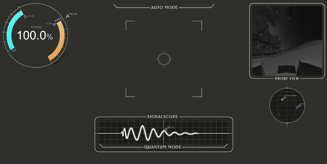 Laying out all the UI together helps me to see if the visuals meld well together overall, since not all these things will be present on the screen at the same time in-game. I can also see, at a glance, if something is standing out too much.
But next comes… implementation! Of course this looks pretty on paper (err.. psd), but we won’t know how successful this UI design truly is until it’s put into the game and tested with players. If you have some further questions about UI or Outer Wilds, let us know in the comments! Thanks, Alice! With so many tools and vital information at hand, it's a tight balance giving the player all the information they need--in the time it took to write this update, there's already been a few vital tweaks! We're excited to take this concept and make it a reality in-game!
Oleg Kosmakov
4/13/2016 05:09:23 am
Hi there. Thanks for update. One question though: are you planning to release some kind of pre-alpha release versions of what you've done so that we could play around and, possibly, report issues, or make suggestions? 9/26/2018 10:59:20 pm
These are the obvious things to manage when you are in the stage of development for the rest of the working. Such discussions are supposed to be made when you are having the logical reasons to talk. 9/13/2020 10:24:52 pm
More on this coming up later, let me leave you organizations with an idea. Consider the possibility that you had only thousand portable numbers, and you realized the specific buy designs
Thanks for sharing this information. We need such information to create CDR Reports. You can get <a href="https://cdrreportsaustralia.com/complete-cdr-report-writing.html">complete CDR Report Writing Service</a> from us. We also provide <a href="https://cdrreportsaustralia.com">CDR Reports in Australia</a>, <a href="https://cdrreportsaustralia.com/cdr-summary-statement-writing.html">Summary Statement Writing</a> , <a href="https://cdrreportsaustralia.com/cdr-review-writing.php">CDR Review Writing</a> and <a href="https://cdrreportsaustralia.com/cdr-career-episode-writing.html">Career Episode Writing</a>. Comments are closed.
|
Archives
January 2024
From the
Updates on our games, our process, and the joys of being Mobius Digital. Categories |
 RSS Feed